

NEXT Magazine
Editorial Redesign & Photography
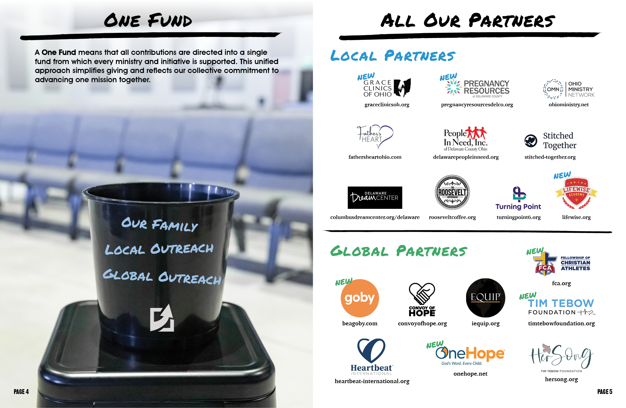
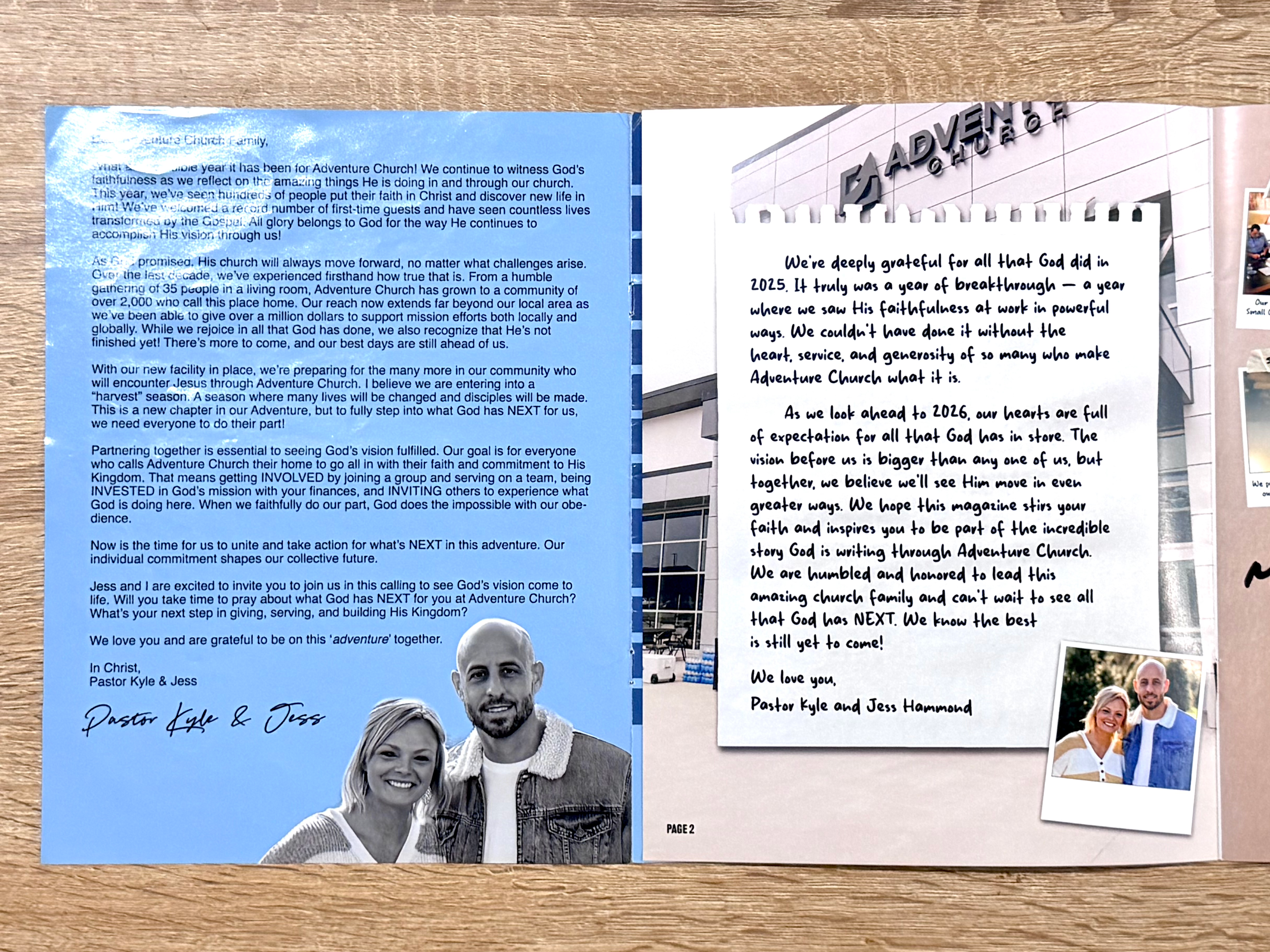
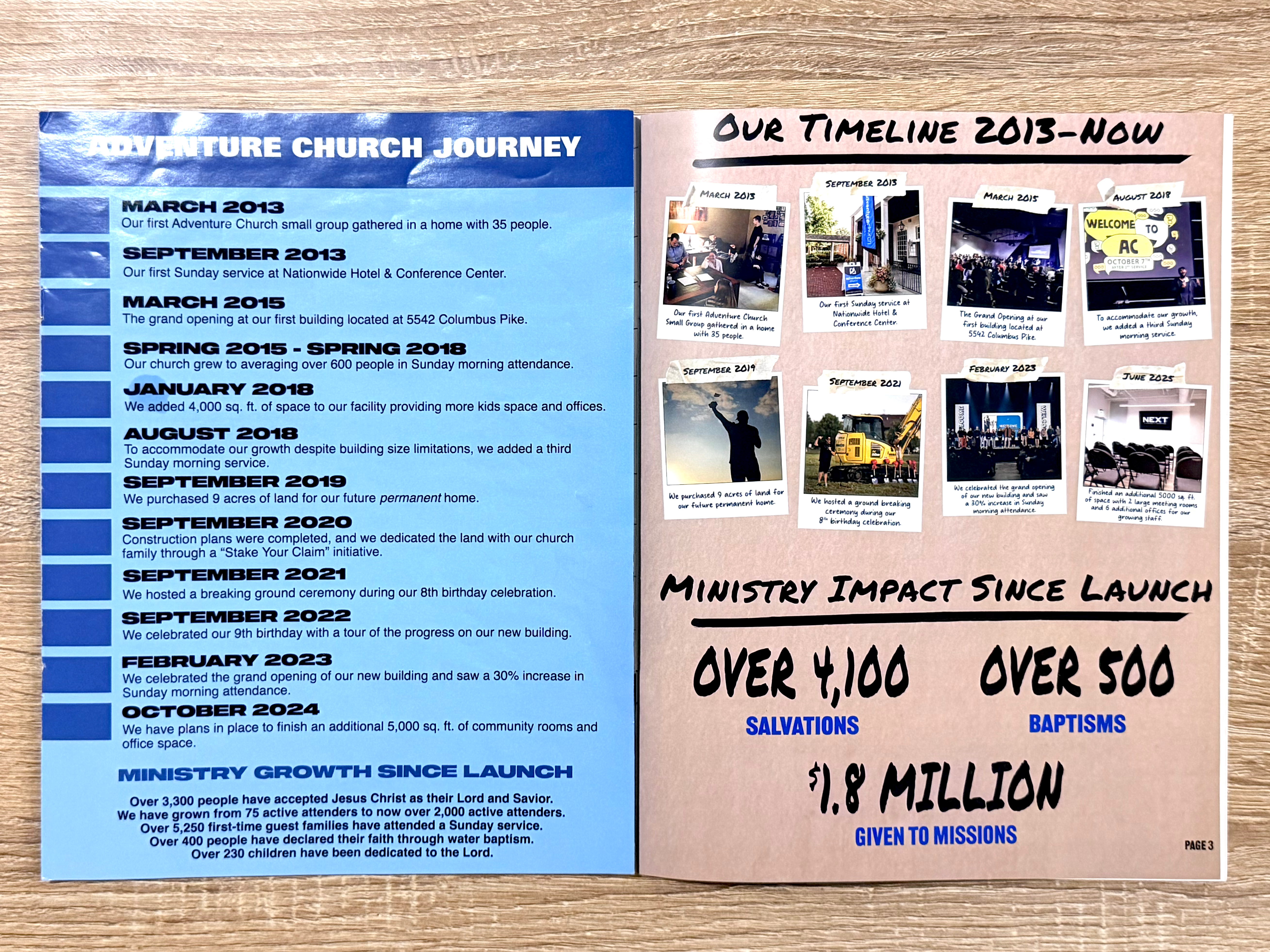
NEXT Magazine is Adventure Church’s annual publication. I was hired to redesign the full magazine to improve readability, modernize the visual style, and create a more engaging experience for readers. The redesign blends editorial layout, brand refresh, and photography integration, including several images I shot and styled specifically for the project.
The Challenge
-
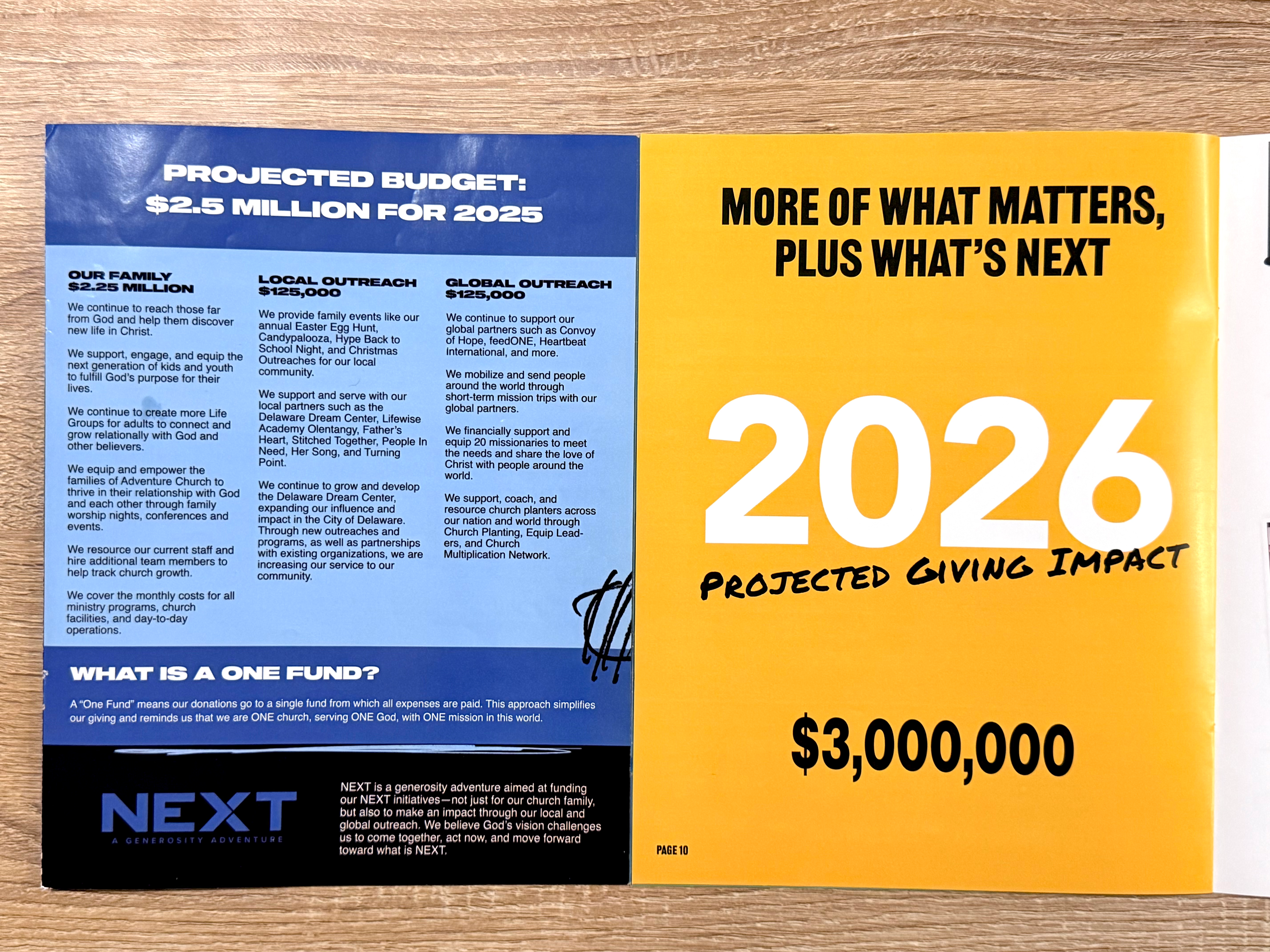
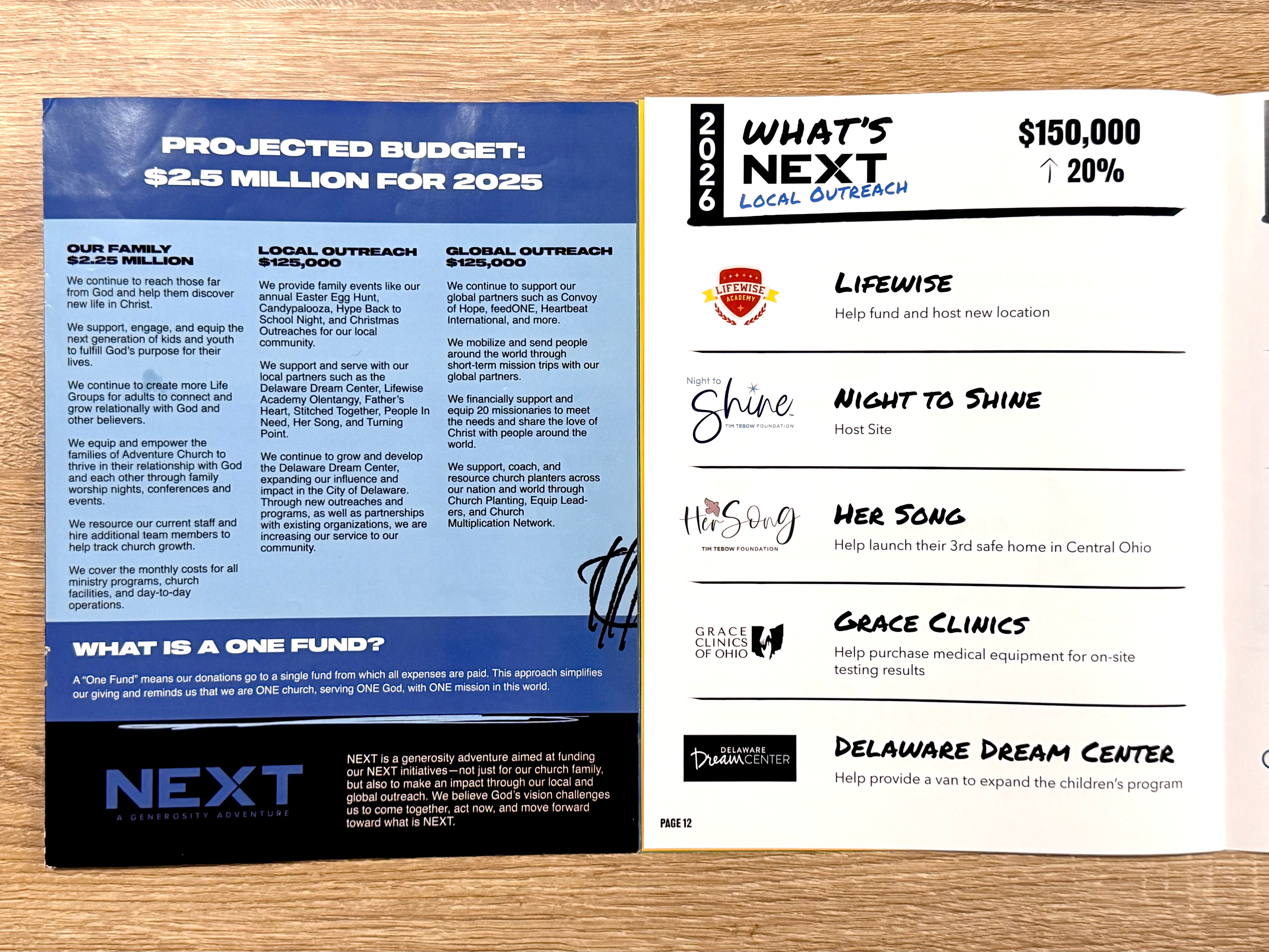
Heavy blue overlays throughout the magazine
-
Dense text with limited hierarchy
-
Minimal photography and visual storytelling
-
Layouts that felt flat and difficult to navigate
-
A need for a publication that felt modern, warm, and mission‑aligned
Key Features
-
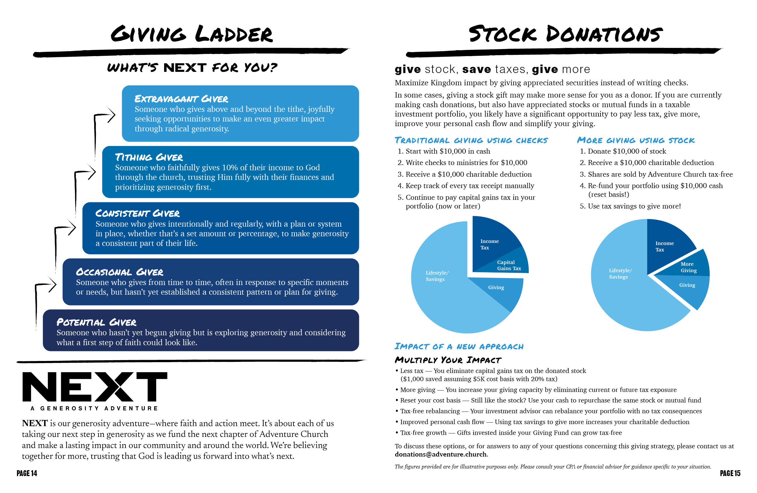
Redesigned Giving Ladder, clearer hierarchy and modern graphic system
-
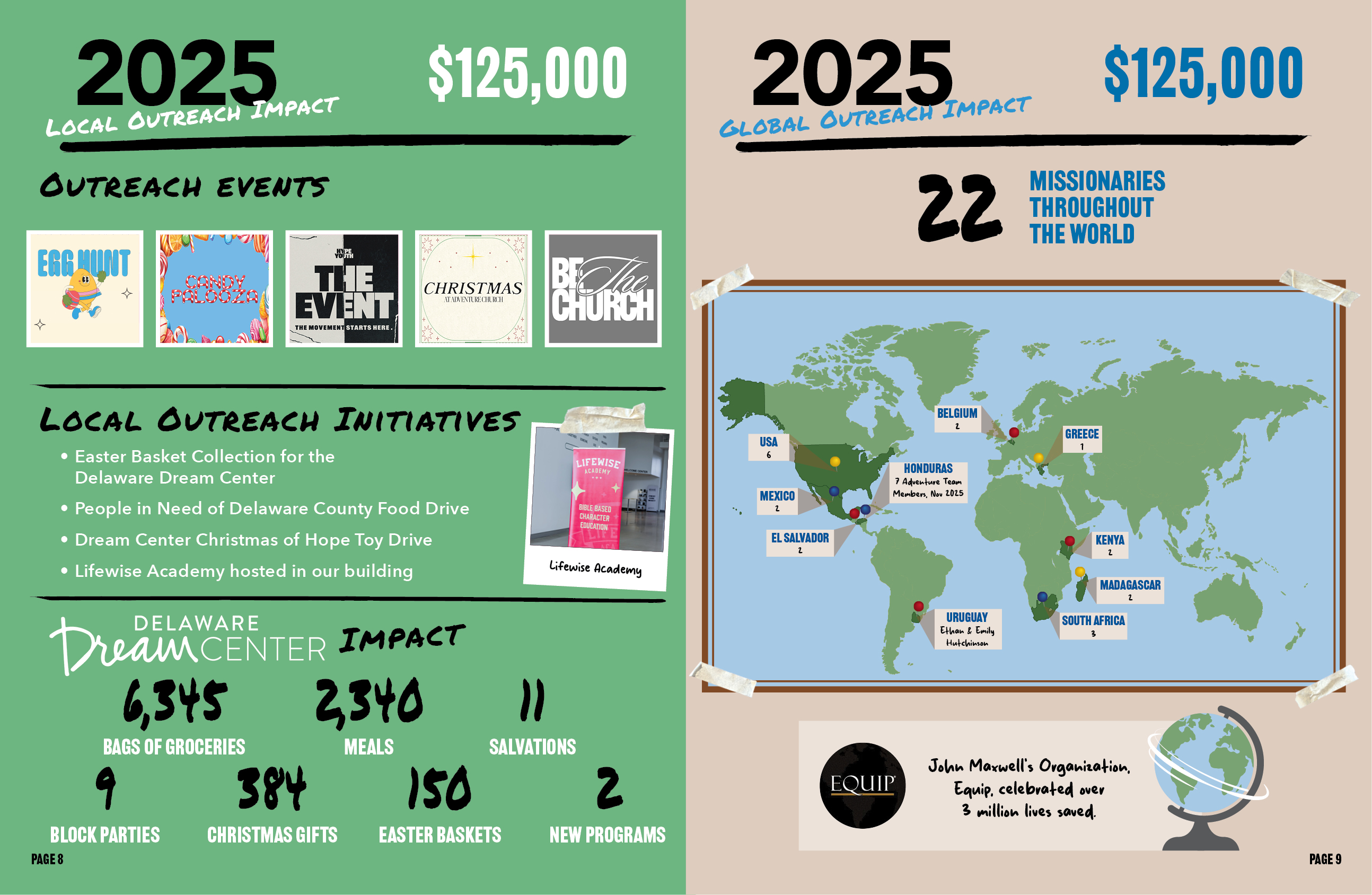
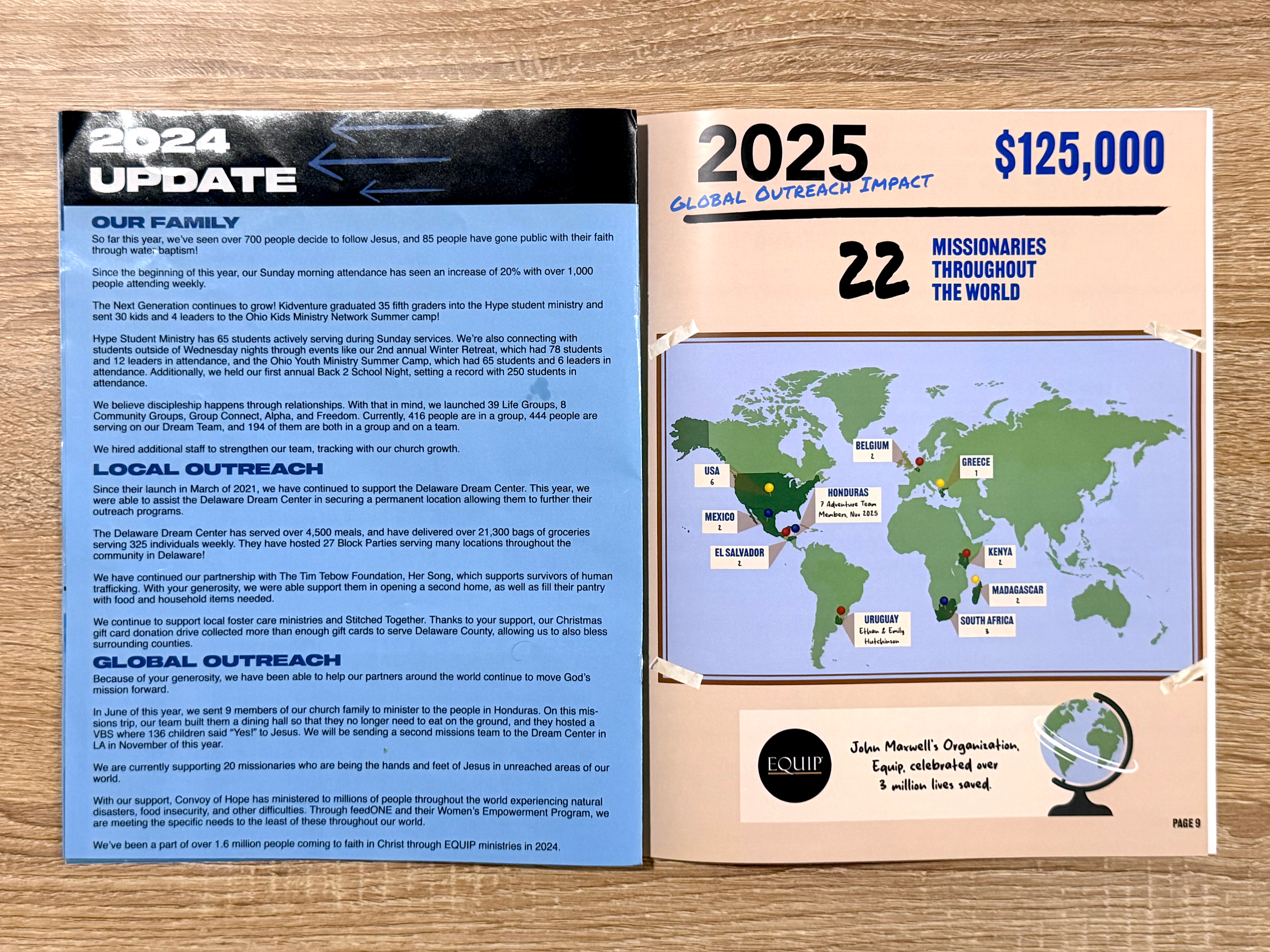
Global Outreach Map, custom world map showing missionary locations
-
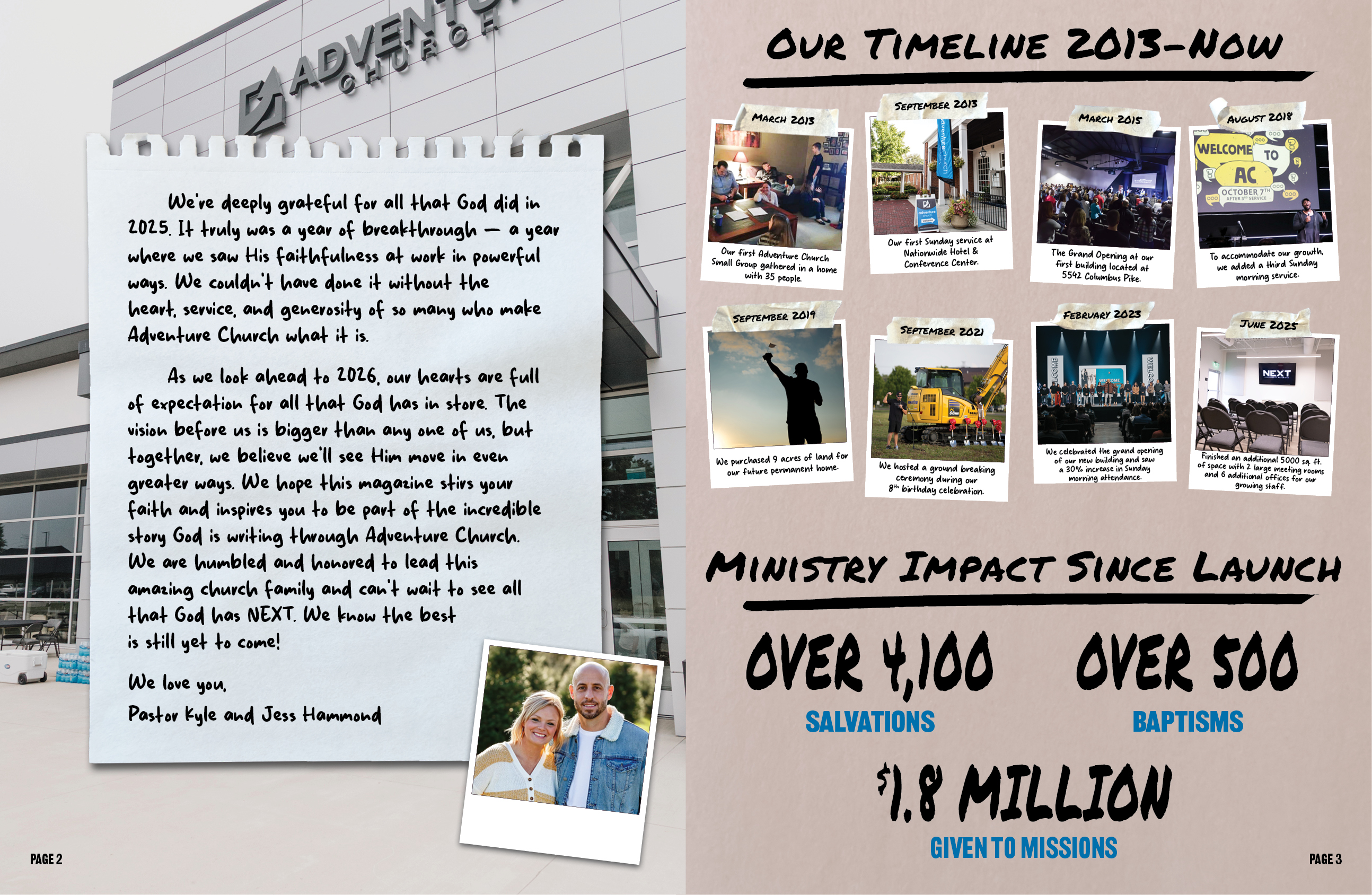
Annual Letter, handwritten‑style design for a more personal feel
-
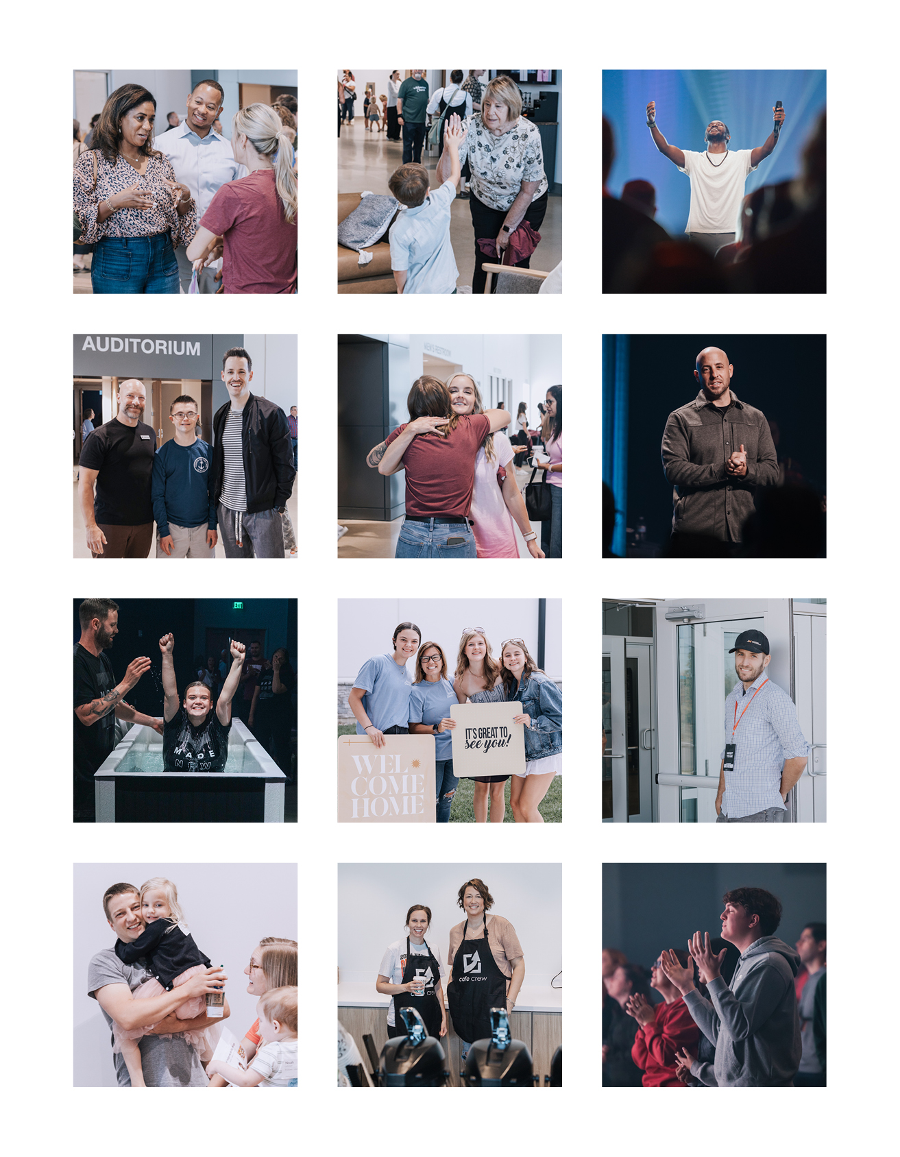
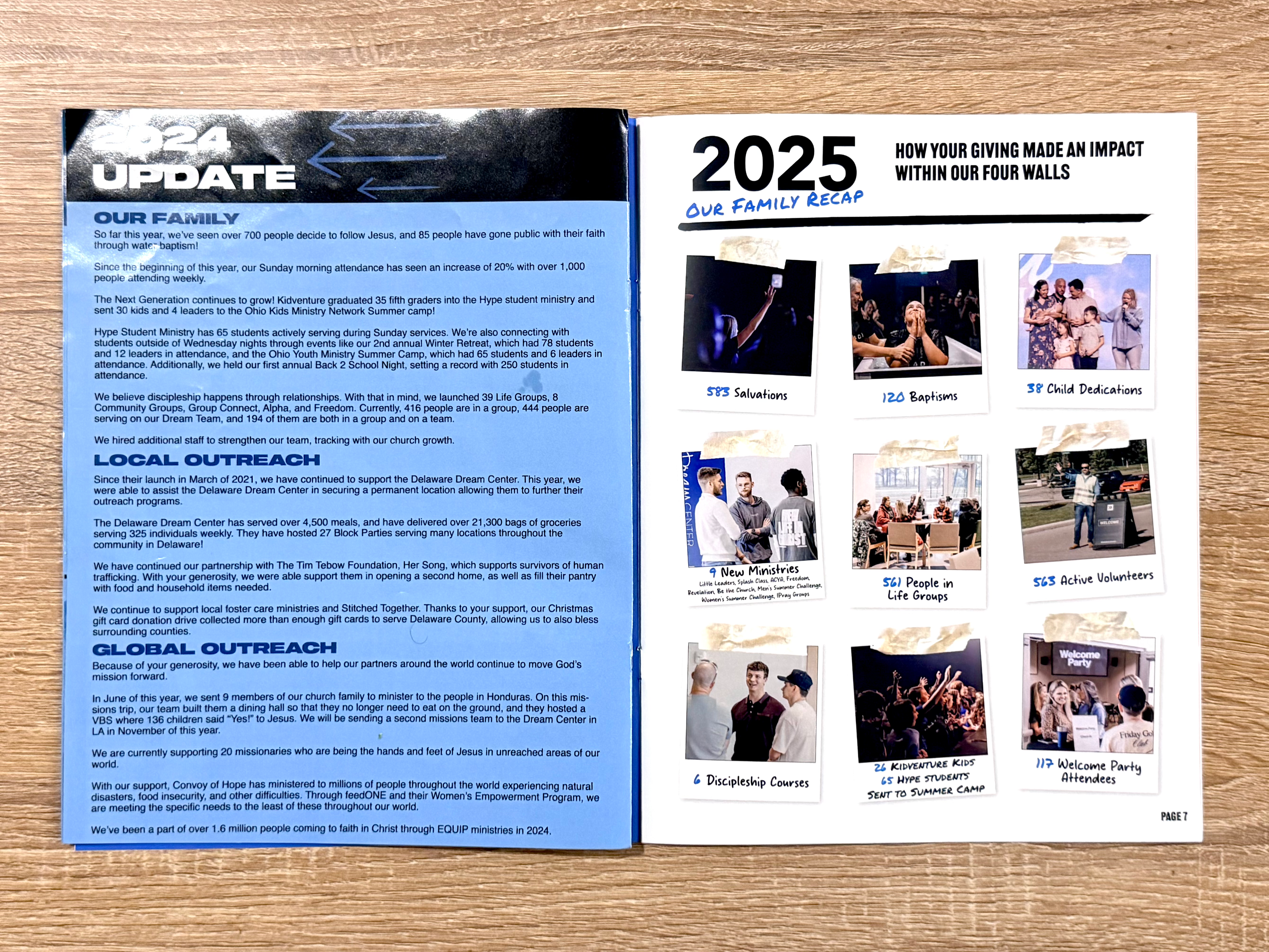
Polaroid‑style photography, some of my photos styled with custom textures
-
Full editorial refresh, pacing, hierarchy, color, and readability
The Approach
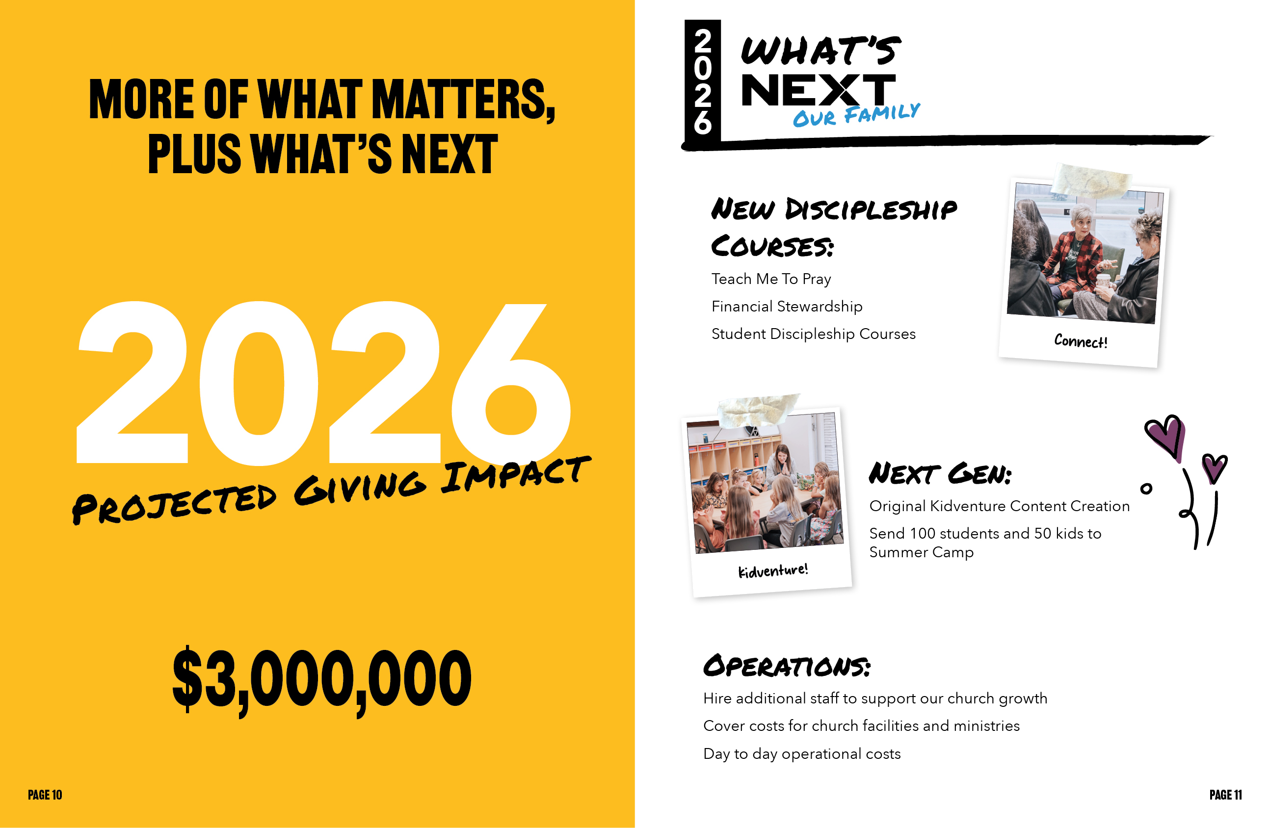
I refreshed the magazine with intentional white space, bold color moments, and layouts that guide the reader through each section.
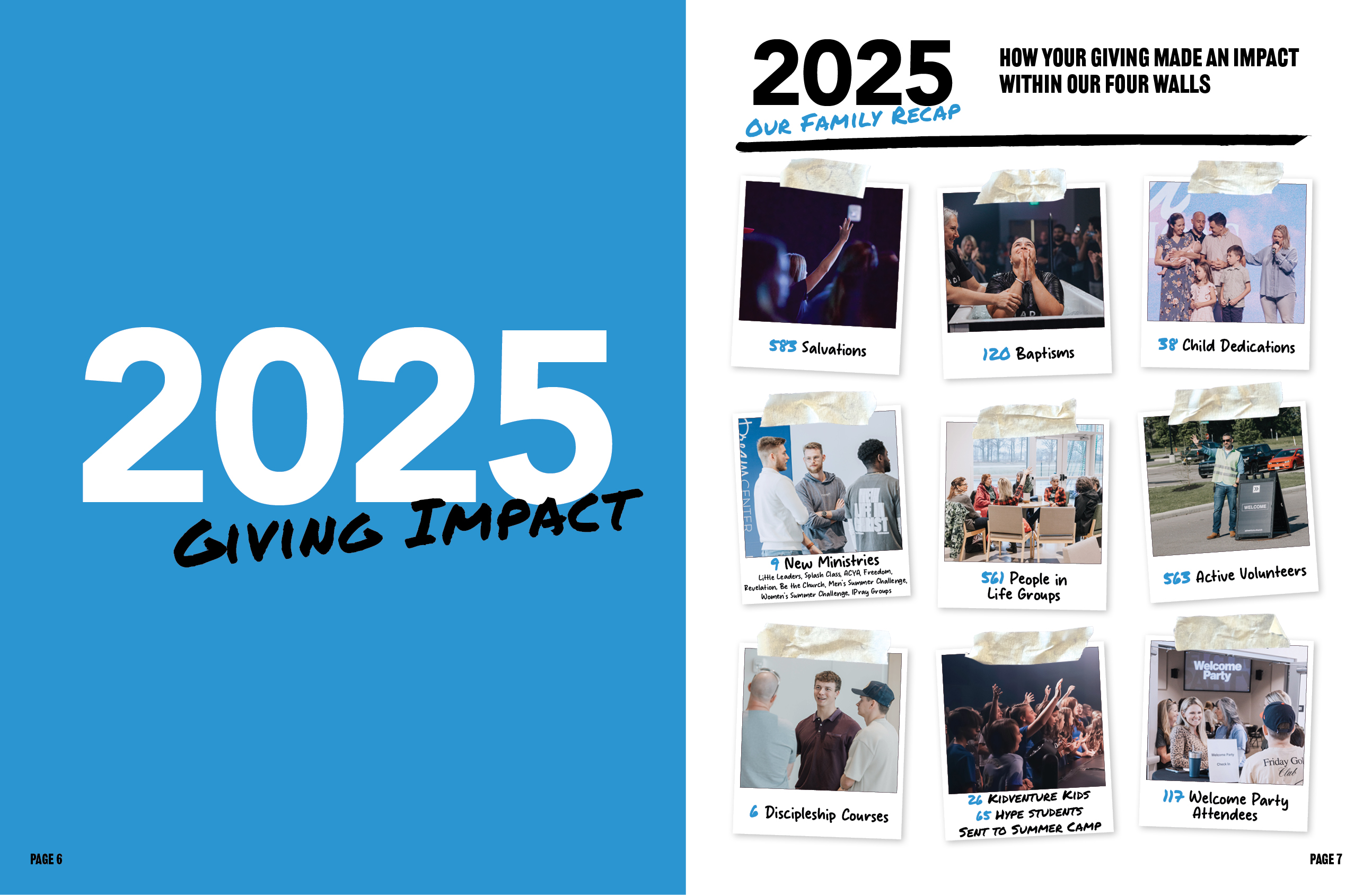
Several of my own photographs were incorporated using a polaroid‑inspired treatment and custom masking‑tape textures that I created, photographed, and edited.
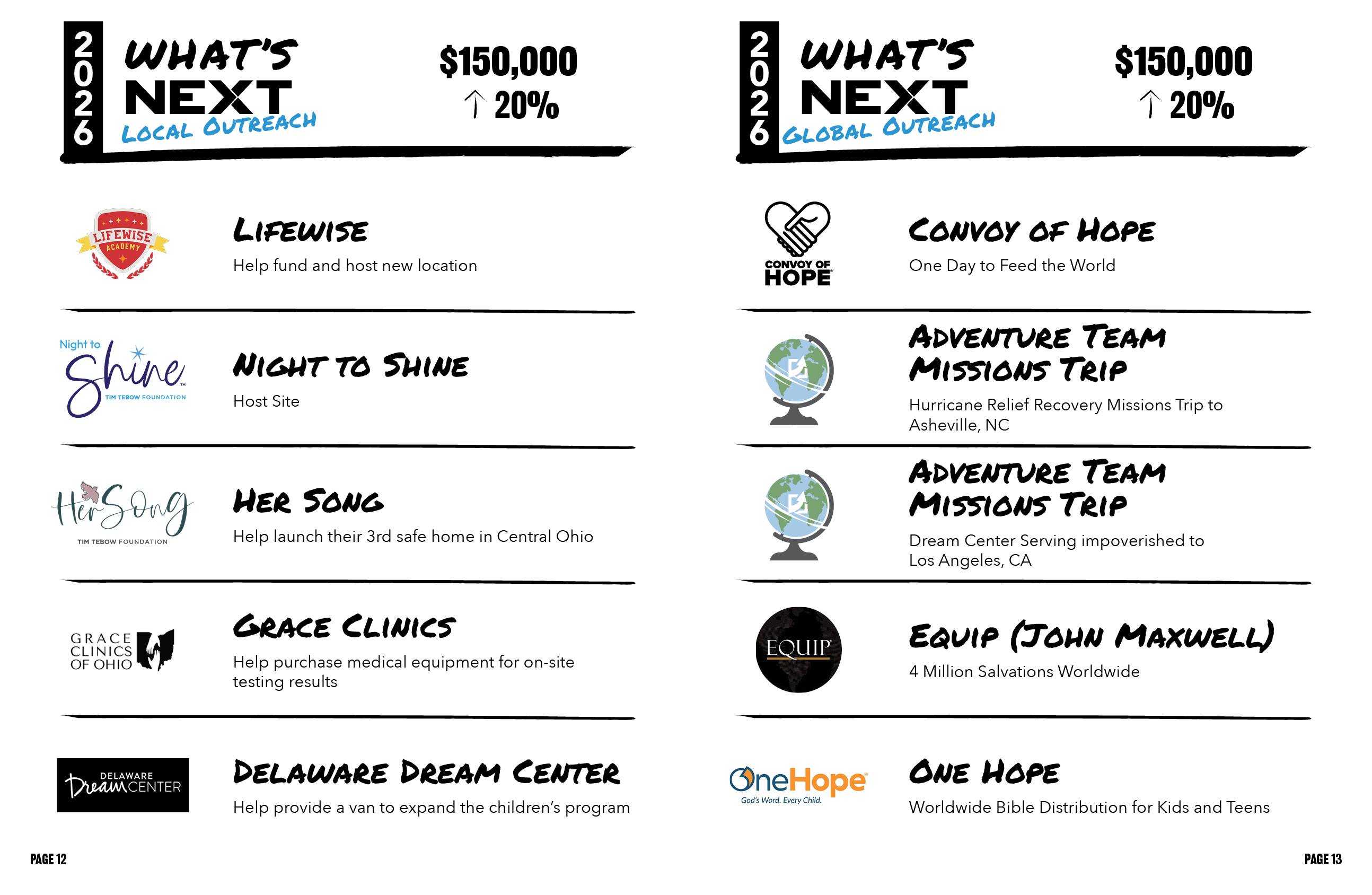
Key elements were redesigned, including the Giving Ladder graphic, the global outreach spread with a custom world map, and the letter from the paster, which was reimagined to feel more personal and handwritten.


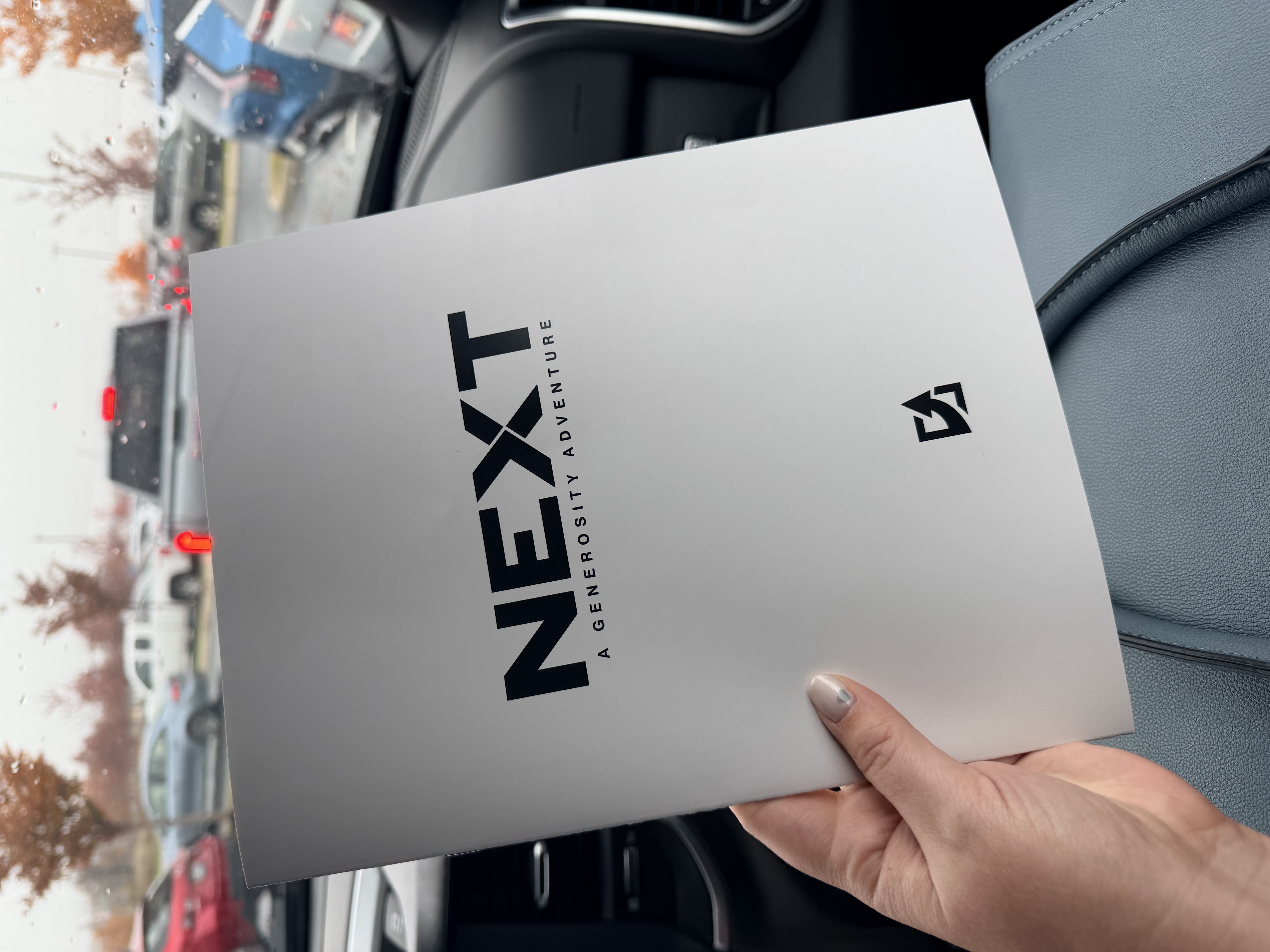
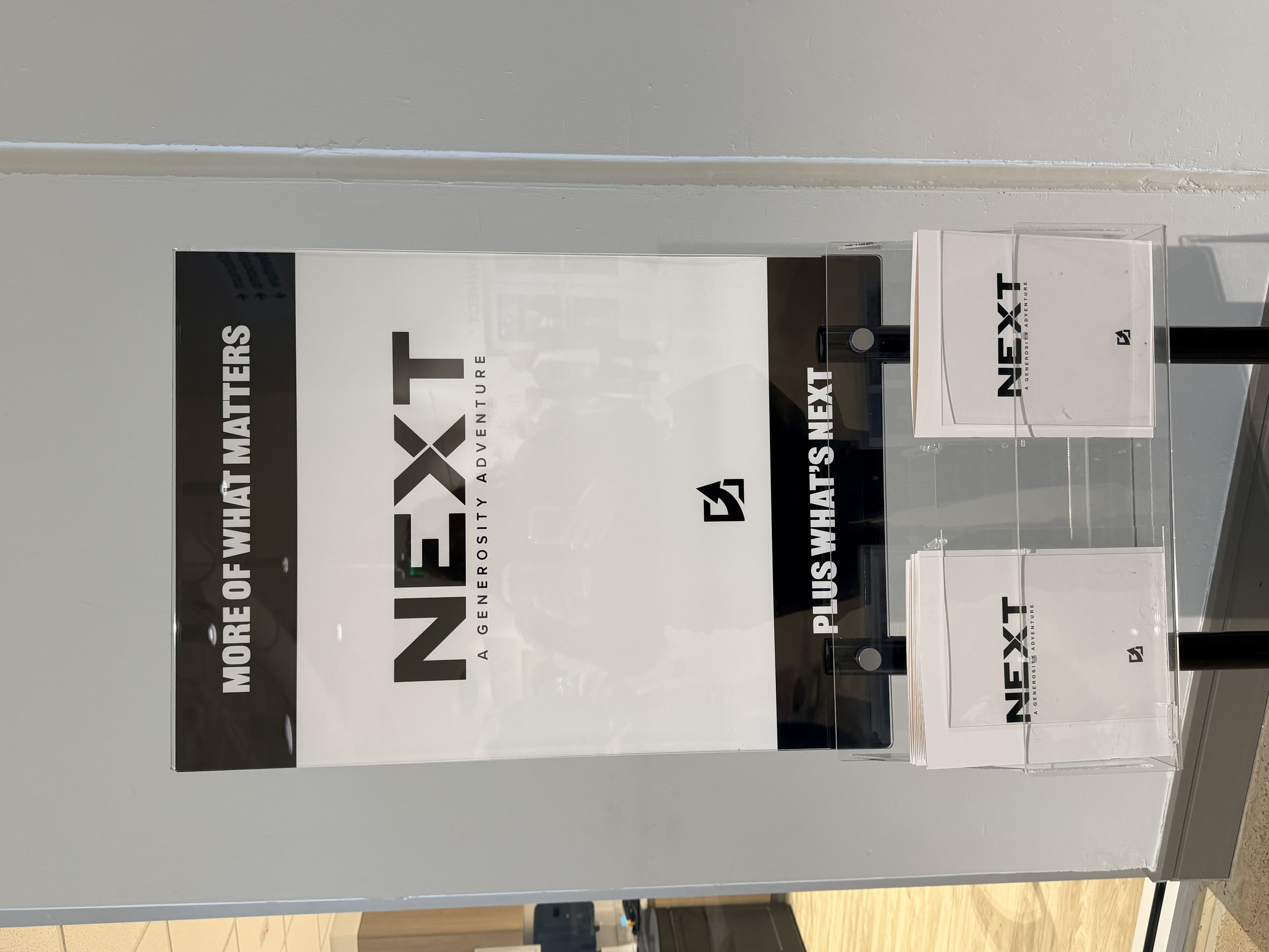
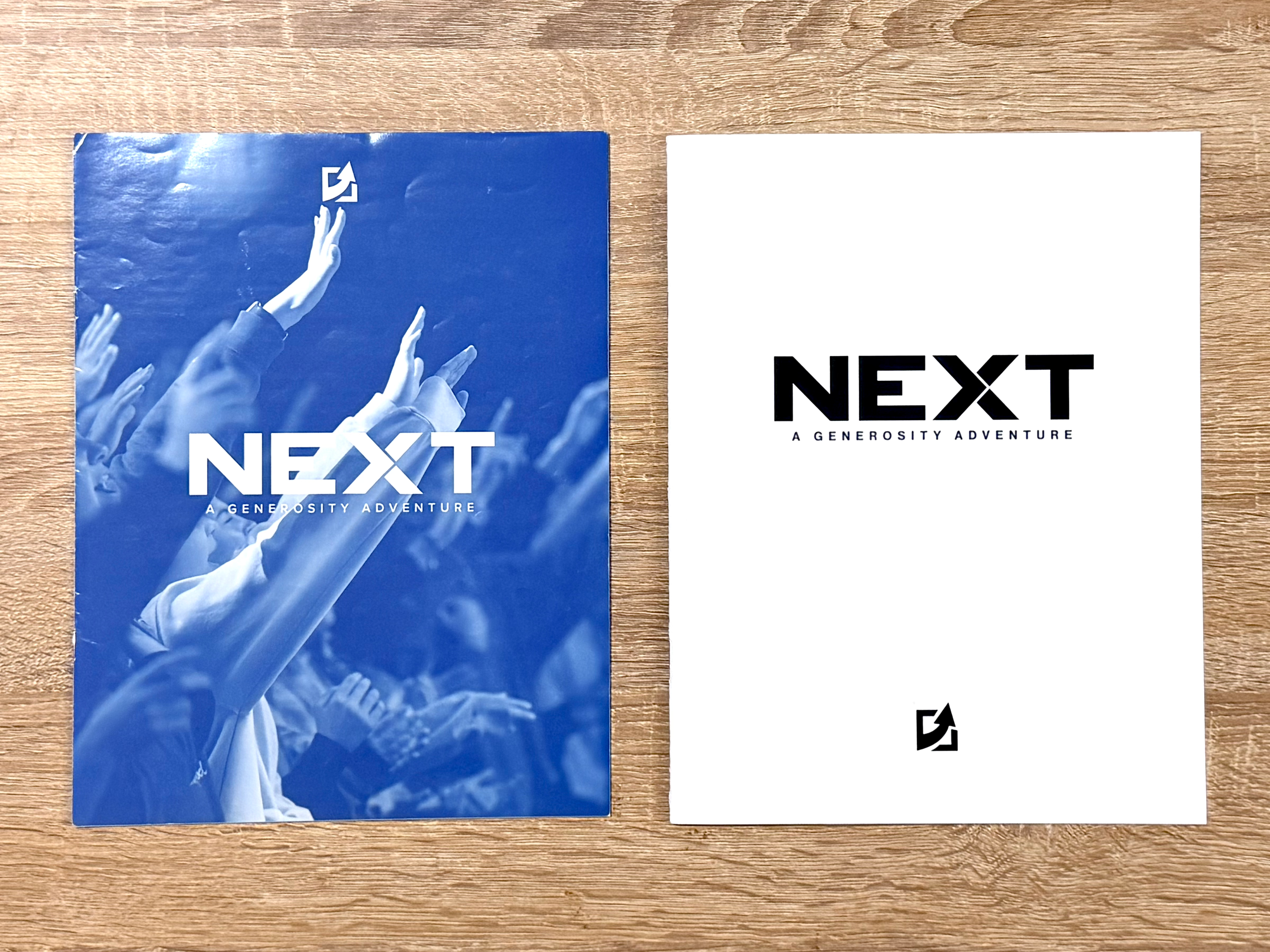
This is a before and after of the NEXT Magazine cover.
This is a before and after of the NEXT Magazine letter from the paster.


This is a before and after of the year global outreach update.
A refreshed graphic system that replaces the old layout and text with a clearer hierarchy, modern color, and a more engaging visual flow.



The Outcome
The final publication is clearer, more inviting, and more fun to explore. It's a thoughtful, story‑driven redesign that reflects the energy and mission of the church. The new layout strengthens visual hierarchy, improves readability, and brings warmth and personality through photography and custom textures.